Jump to content

Help needed with New Pictures.


Juan Vancouver
This topic is 4549 days old and is no longer open for new replies.  Replies are automatically disabled after two years of inactivity.  Please create a new topic instead of posting here.  

Recommended Posts

Hi everyone!


I am in a bit of a conundrum: I got some pics a couple days ago and when I reviewed them today trying to choose which ones I was going to upload to my ad, I realized that some of them were a little too similar. Since the number of pictures that one can upload into an ad is somewhat limited (at least on rent boy) I would like your opinion about them.


Is it overkill to upload the four of them, even if they are somewhat similar?


If it is too much, which ones should I upload and why?


Any input will be much appreciated.


Picture 1

http://ecs1.gaydar.net/newphotos/78/24/7885024_626836.jpg


Picture 2

http://ecs2.gaydar.net/newphotos/78/24/7885024_327785.jpg


Picture 3

http://ecs3.gaydar.net/newphotos/78/24/7885024_716746.jpg


Picture 4

http://ecs3.gaydar.net/newphotos/78/24/7885024_158434.jpg

Link to comment
Share on other sites

Hi everyone!

...

Is it overkill to upload the four of them, even if they are somewhat similar?

If it is too much, which ones should I upload and why?


They are all hot and fun and my favorite is #1.

While your face is partly obscured it is obvious that you are a very good looking man.

Your handsome ear draws my gaze to your great nose, and lips which are nicely framed by your big arms.

In this photo the chain on your neck has an mysterious ambiguity, we don't see the front of the chain, how it lays and what it might have attached to it.

Lastly, well the first or second thing I noticed, is the nice large package. It looks like it is about to get even a lot larger. Probably will no longer be able to contain it in your jock.

Turns me on, piques my curiousity and whets my appetite!


Picture 1

http://ecs1.gaydar.net/newphotos/78/24/7885024_626836.jpg

Link to comment
Share on other sites

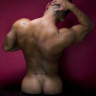
I agree with Raul, I liked #1 because you can see part of your face...and the frontal shot shows a nice package, 'Very Hot' and I liked the last one, great shot from the rear, and your back, ass and legs look spectacular. I would probably not upload all of them, as you are right, as a set they seem too similar. Looks like you Canadian boys are having some great fun up there....

Link to comment
Share on other sites

I would agree that perhaps you should hold back from posting all of them at once. Plus, it gives you flexibility to keep your ad fresh by swapping the pics a month or so later. If others are like me, clients love ads that are regularly updated with fresh pics; it definitely keeps us engaged on the target of our desires.


As for me, I love 3 and 4. I'm a chest man, and 3 lets me see the pecs, and I'm a butt/legs man, and 4 takes care of that too. By the way, your butt looks delicious. ;)

Link to comment
Share on other sites

Hi everyone!


I am in a bit of a conundrum: I got some pics a couple days ago and when I reviewed them today trying to choose which ones I was going to upload to my ad, I realized that some of them were a little too similar. Since the number of pictures that one can upload into an ad is somewhat limited (at least on rent boy) I would like your opinion about them.


Is it overkill to upload the four of them, even if they are somewhat similar?


If it is too much, which ones should I upload and why?


Any input will be much appreciated.


Picture 1

http://ecs1.gaydar.net/newphotos/78/24/7885024_626836.jpg


Picture 2

http://ecs2.gaydar.net/newphotos/78/24/7885024_327785.jpg


Picture 3

http://ecs3.gaydar.net/newphotos/78/24/7885024_716746.jpg


Picture 4

http://ecs3.gaydar.net/newphotos/78/24/7885024_158434.jpg


1 and 4 are good—2 looks like you're trying to ward off a blow and 3 looks like you stepped on a nail. What's funny is that even with that dramatic posing, I recognized immediately that it was you, Arnold Kimpleschmitz—all the way from Grundy Center, Iowa!


Looking good Arnold—I mean, Juan.

Link to comment
Share on other sites

all are good . #1 is great. I think were I in the market for a bottom your ass shots are to die for and if I was lookng for a top the bulge in your jock would make my knees tremble. I am glad to see a guy actually think about his pics. I think sometimes we just snap one and post it without really thinking about it.

Link to comment
Share on other sites

Everyone has an opinion but few know what they are talkin about.


#4 is my least favorite because it lacks energy. The remote trigger control in your right hand is distracting.


The crop of the foot in #3 is a tad amputee. Some people are into that. Don't like the lighting hot-spots on your chest and torso. A different light source would have come in handy here.


#2 is OK but it looks like you're very intent on not showing any part of your face, which never sends a good message, IMO.


#1 seems to hit all the right chords, except I would change the graphics. There's room for a great font/name-logo but the font design you selected does nothing for me.


Some escorts post almost every image from a shoot, which, IMO, is a disaster. Even though the lighting is basically the same in all 4, the poses are completely different as well as the body language. So, similar? Yes, but not really.


The similar that annoys me (and marks someone as not having a clue) is the escort who can't edit. Most fall into this category.


Good luck.

Link to comment
Share on other sites

What's funny is that even with that dramatic posing, I recognized immediately that it was you, Arnold Kimpleschmitz—all the way from Grundy Center, Iowa!


Looking good Arnold—I mean, Juan.


Oy Vey! Finally this meshugas of trying to hide my punim and identity has come to an end! I am so verklempt that I have spilkes in my genektikezoyt! A shaynem dank, Max, Thank you very much! All this work to revert my own briz will pay chai kock in the end! Go ahead, call me Arnie from now on.


As for watermarking the images, I have to confess that I am not terribly worried about anyone stealing them. It has happened in the past, and can't say it won't happen again. I just think that the images we can post in most sites have to be so small that all the quality and detail is lost, to add on top of that the distracting font over the body. Thank you for offer to help, though, Anton.


To all the rest of you, thank you very much for your input. I really appreciate it and will consider it carefully.


Big hug to everyone!

Link to comment
Share on other sites

#4 is my least favorite because it lacks energy. The remote trigger control in your right hand is distracting.


The crop of the foot in #3 is a tad amputee. Some people are into that. Don't like the lighting hot-spots on your chest and torso. A different light source would have come in handy here.


#2 is OK but it looks like you're very intent on not showing any part of your face, which never sends a good message, IMO.


#1 seems to hit all the right chords, except I would change the graphics. There's room for a great font/name-logo but the font design you selected does nothing for me.


Some escorts post almost every image from a shoot, which, IMO, is a disaster. Even though the lighting is basically the same in all 4, the poses are completely different as well as the body language. So, similar? Yes, but not really.


The similar that annoys me (and marks someone as not having a clue) is the escort who can't edit. Most fall into this category.


Good luck.


I disagree about #4—I think it's reminiscent of a classic Charles Atlas pose, but would be better cropped tighter and in a slightly more dramatic fashion. I actually love the font (and you could even go up a step and use a lighter version), but the color/leading/justification is awkward.

Link to comment
Share on other sites

Juan, I think all four are very sexy images and accentuate your various physical attribute quite nicely: 1) big bulge; 2) built legs and big arms; 3) tight, hard abs/strong core;

4) muscular bubble-ass. They don't seem "too similar" to me. Posting all four would serve you extremely well, imho.

Link to comment
Share on other sites

#2 and #3 are my favorites. I can't see where you would go wrong with including any or all of them in your ads. If you feel they are too similar, consider occasionally rotating the pics in and out of your ad--keeping it fresh.

Link to comment
Share on other sites

Archived

This topic is now archived and is closed to further replies.

  • Recently Browsing   0 members

    • No registered users viewing this page.
×
×
  • Create New...