SirBillybob
-
Posts
3,655 -
Joined
-
Last visited
Content Type
Forums
Donations
News
Events
Gallery
Everything posted by SirBillybob
-
I stand corrected. The research emerging on MPXV current outbreak suggests that anogenital area is the most common location of lesions, suggesting that apart from symptomatic presentation that can occur in other locations of the body some time following incubation there is a predisposition in the context of GBMSM transmission for lesions to emerge at the site of viral inoculation, ie, where anogenital body parts (often mucosal) merge … or oral-oral, oral-anogenital, what have you. That said, there is often another concurrent STI. There may also be a surveillance selection bias in which men with anogenital lesions as initial body location are presenting to STI, PrEP, etc clinics and overrepresented in such settings conducting detailed tracking. Nevertheless, supports condom use. It remains to be seen whether the pattern of lesions in the overall population would be more consistent with assumptions about MPXV pathogenesis prior to the current unique subgroup susceptibility and case incidence.

-
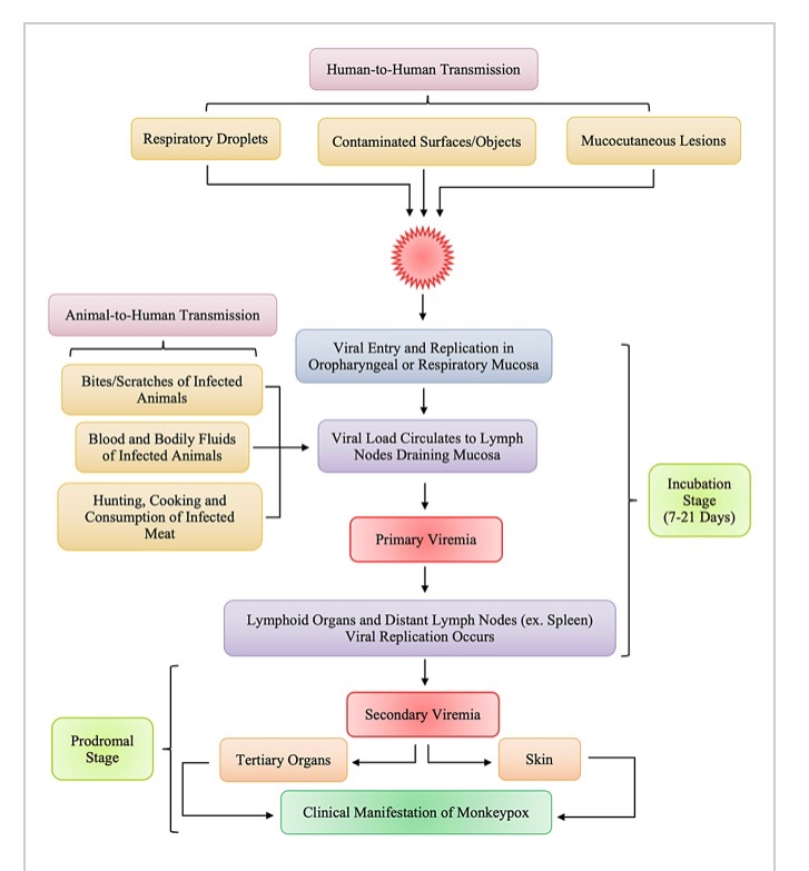
Correct. Your body doesn’t care whether you breathed in respiratory droplets from your pet prairie dog while cuddling it or sucked a guy’s dick that had a lesion.
-
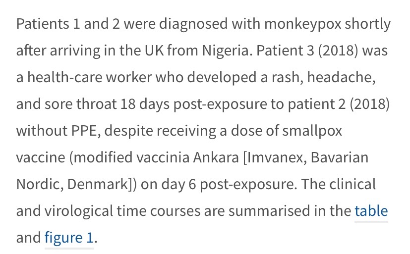
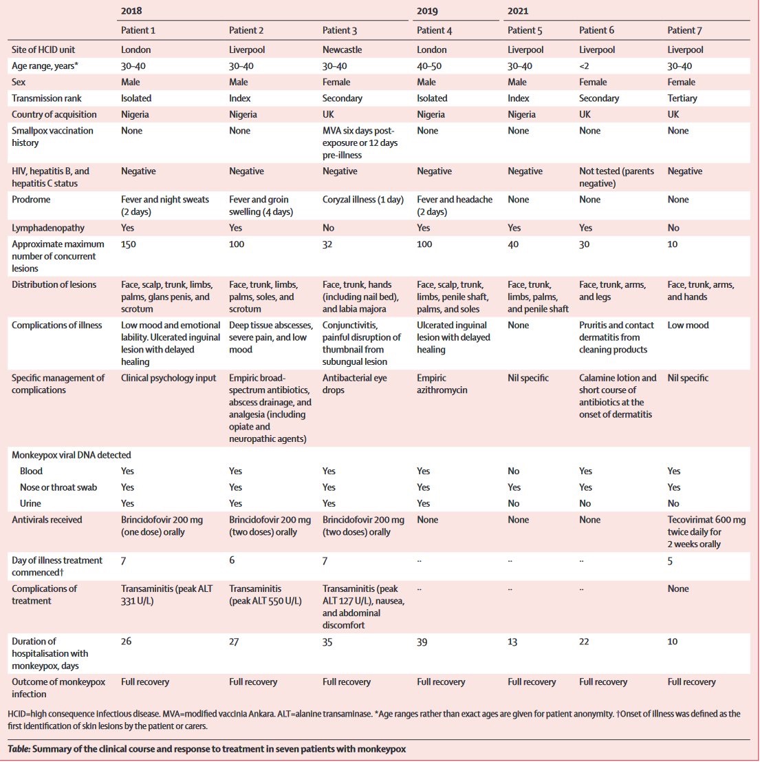
Aha, so we do know MVA-BN PEP vaxx breakthrough can occur: Patient #3 in the table, surveillance of 7 Monkeypox cases UK recent years. What is unknown is whether there were any PEP recipients within contacts related to the 7 patients, those recipients, if any, not acquiring infection. The recent PEP-tracking study in Paris recommends PEP within 4 days of exposure, a timing reference suggested elsewhere, but the vaccination group will receive MVA-BN up to 14 days following exposure.
-
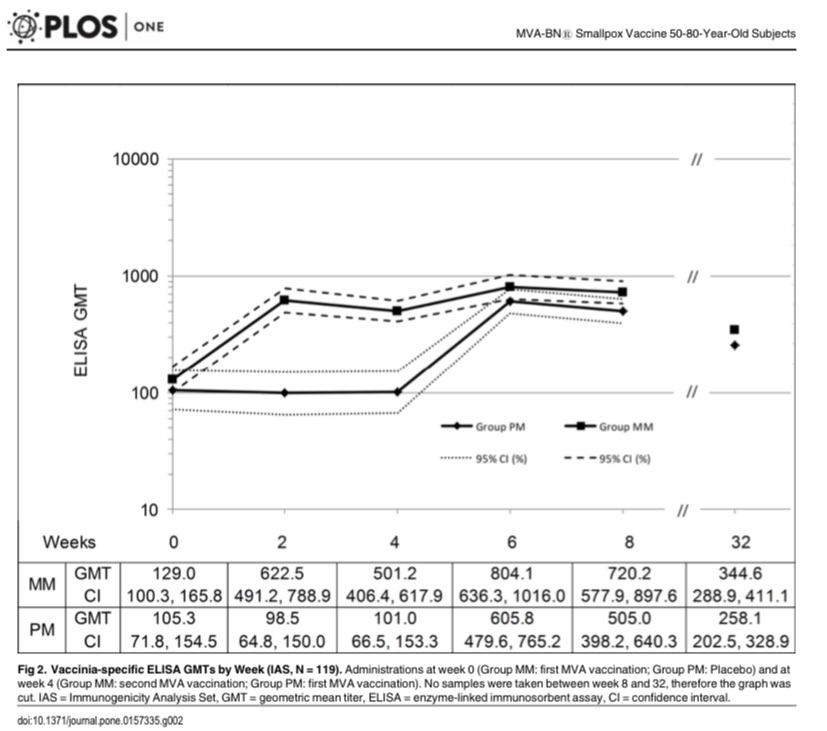
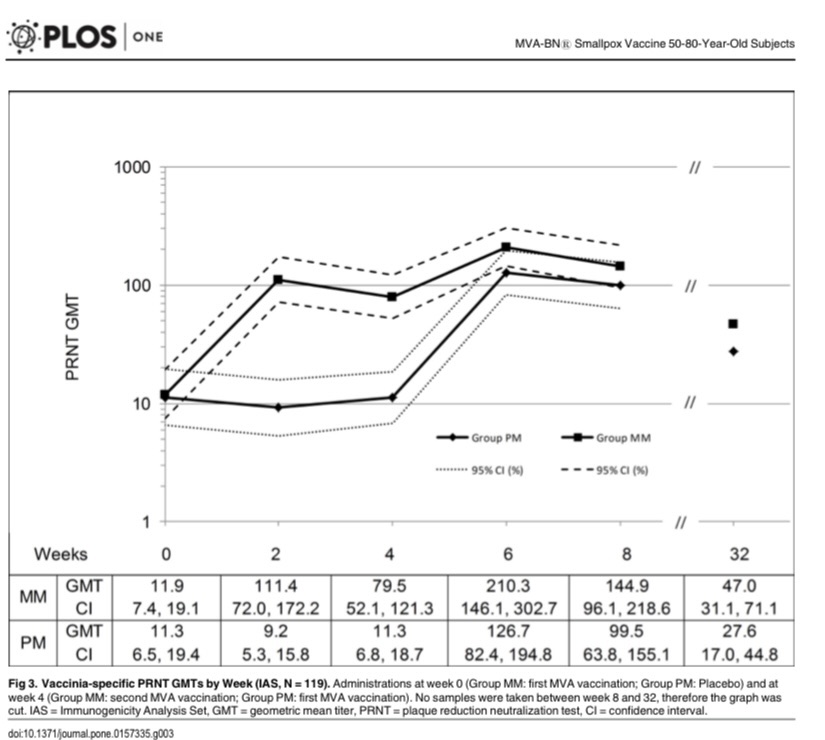
Of course this suggests the imperative of education of both sides of the transaction about the reality of possible differences between prime-dose and boost-dose immunity AND reciprocal candor of both players regarding dosing quantity and temporal history. It would also be up to both sides to determine risk tolerance for scenarios in which clients with Smallpox vacccination background, likely a sizeable consumer majority, have had one recent MVA-BN dose. There is little immunogenic difference between 1 and 2 doses over several months in terms of protection against Smallpox. For Monkeypox the risk assessment according to protection extrapolated from Smallpox protection will be ‘to each his own’. My sense is that regional Monkeypox incidence differences override any effectiveness differences specific to the two Orthopox varieties, assuming of course less than 100% efficacy. Anticipated (so far none explicitly reported) vaccination breakthrough infections can potentially be greater in number in high incidence regions in spite of higher vaccination uptake. Group MM is 2 doses with 4-week interval; Group PM is placebo for 1st dose followed by single MVA-BN dose at 4-weeks.
-
I had exactly that phenomenon. Emerged suddenly at Day6 following MVA-BN and 90% resolved by Day8.
-
Interesting read on perceptions of Bavarian Nordic funding source history, coupled with proportional share of bulk vaccine supply headed to fill-and-finish and delivery, as well as sensitive dynamics regarding responsibility allocation. https://healthpolicy-watch.news/exclusive-china-monkeypox-bavarian-nordics/
-
Credible, as you took the Jynne-oath.
-
Intelligent, responsible inquiring minds here want to know. Immunologists and virologists are asking the same questions among themselves.
-
That’s a very relevant question and the answer is easy. The answer is no. Nobody can say how much protection one gets from a single dose of MVA-BN, or for that matter the 2-dose regimen, no matter how the language is packaged. The idea that there is any benefit at all to MVA-BN is inferred from particular types of research that are far from the ‘gold standard’ efficacy research that underpinned, for example, COVID vaccination. ——- For those interested: What is known specific to Monkeypox as a virus distinct from Smallpox is that 1st generation Smallpox vaccine reduced Monkeypox attack rates in Dem Rep Congo when small outbreaks were tracked in the first half of the 1980s decade and in the middle of the 2000s decade; both periods suggesting a 5-fold susceptibility to infection among the unvaccinated that translates to 80-85% protection for the inoculated. The durability of that protection along with the assumption that MVA-BN single dose is noninferior to 1st generation Smallpox vaccine forms part of the basis that it currently offers some protection. That it is “up to 85%” is a premature S T R E T C H, when one considers the rigour of COVID vaccine research.
-
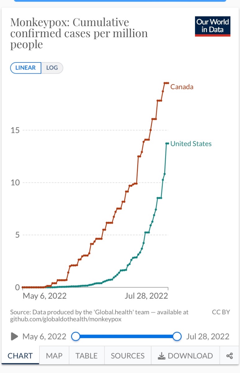
NYC Man is absolutely correct. Uniformity is important. I am second-guessing here, and BTW I have no role on how things are done, but various jurisdictions are juggling prospective MVA-BN supply while drawing from limited recent research on incidence trends in order to squeeze out the biggest containment bang for the buck. A willy-nilly hand-picking from, say, the recent NEJM case surveillance findings does not fly well and contributes to mayhem. That in itself does not negate the PEP++ approach. Canada, where I am, has been less rigidly aligned with dispersion factors and, as is known, has a come-one-come-all approach that commenced early in the incidence trajectory I append here. Not a robust impact on cumulative cases. Rolling incidence is fortunately beginning to level off likely due to the higher-risk more MPOX-susceptible vaccinees having been scooped into the campaign’s efforts. Among hundreds of nations Canada had, by chance and design, a fairly ample supply of MVA-BN in its decades-long Smallpox Contingency stockpile, more recently supplanting earlier vaccine supply with MVA-BN, while other nations’ stockpiles where there are contingencies reflect 1st and 2nd gen vaccine.
-
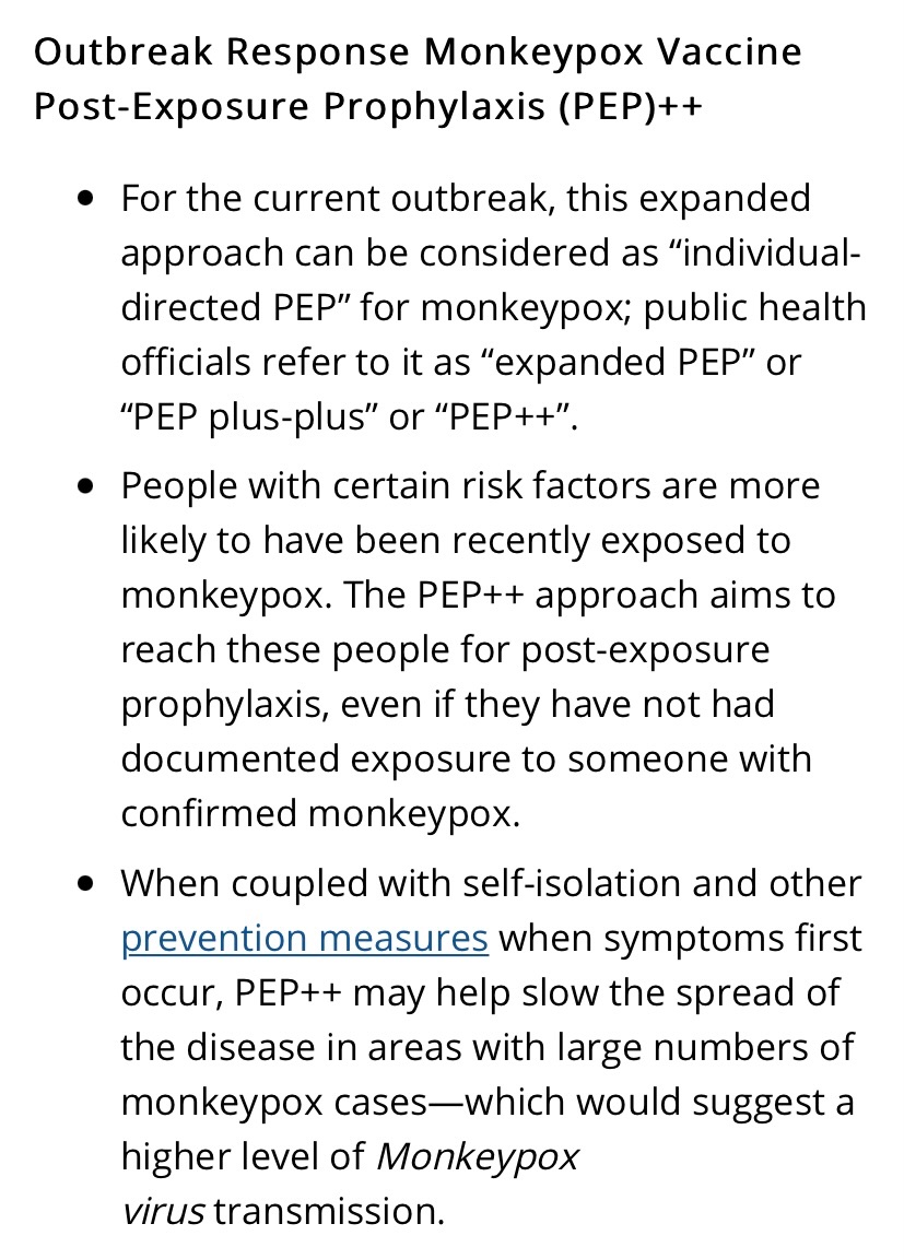
Current HIV PrEP uptake is highly correlated with both risk and incidence of Monkeypox infection. As such, it is a clear identifiable dichotomous variable to integrate into the eligibility hierarchy, not unlike age wrt to CoV vaccination. Similarly, age wrt CoV was correlated with cluster transmission owing to settings housing the aged. This is analogous to PrEP recipients’ trends of congregating with like and stimulating forward transmission. The HIV PrEP subgroup priority is similar to PEP ring vaccination, but it is more anticipatory than established exposure to a confirmed case. The CDC is now categorizing this as Monkeypox PEP++, not PrEP. The latter category is reduced in scope and specific to occupational exposure such as lab work directly with orthopox viruses. There is nothing odd about PEP++ if supply is limited and mitigating incidence is the goal …
-
The hands down the pants of the antsy guy may have reflected arousal, for sure, but maybe arousal by uncomfortable lesions.
-
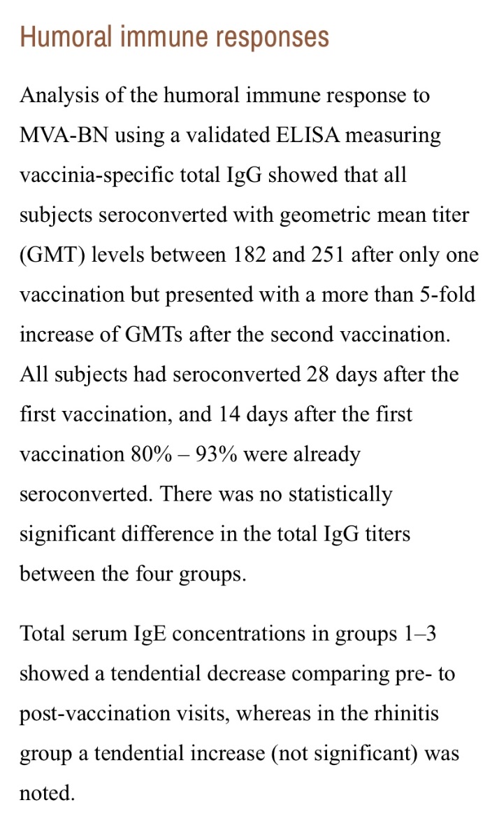
In the interests of taking what we can get even from very small bodies of research, and applying it, a small safety/immunogenicity study of MVA-BN in eczema subjects and controls (N=60) a few years ago suggests waiting a bit longer than 2 weeks following 1st dose. For a small percentage, no difference among subgroups, the humoral immunity standard occurred some time after, maybe not 4 weeks needed but >2 weeks. No seroconversion testing between Day14 and Day28. Add this caveat to likely less than 100% efficacy even with seroconversion. I meant to crop out the 2nd paragraph in the screenshot; it’s unrelated to this post.
-
So reckless of the dismissive escorts for their own health security as clients would rightly assume that they themselves do not pose a risk to providers as transmission vectors. It is reasonable for clients to assume a provider would have added personal vaccination to their own hygiene playbook even if a random hook-up hasn’t.
-
The risk could be attenuated depending on vaccination with at least the prime dose of MVA-BN, at least 2 weeks prior, of dancer [good], dancee [good], or both [better]; same idea for total recovery from a recent Monkeypox infection.
-
Further to question of resident specificity, state of MASS indicates living or working in that state, so I think it may be boundaried across the nation. In Canada, it’s pretty much ‘honey badger don’t care’ where you live.
-
It’s all National Stockpile but what ‘resident’ means is ambiguous. I might infer that it is not explicitly inclusive of non-residents due to the desire to avoid openly exclusionary language.
-
CDC is working with FDA on expanded paediatric access Jynneos considerations, I would assume initially PEP, though LA bulletin already suggests available in exceptional circumstances.
-
Adjusting for population age pyramid proportions, the attack rate is nevertheless much higher, 4-fold, for the younger group. This is consistent with tracking estimates of risk ratio for Monkeypox disease in surveillance of small contained outbreaks, comparing across the same dichotomous variable, historical Smallpox vaccination or not. Age cut-off as the dichotomous variable has always shifted since 1980. However, the share of the vaccinated population is considerably reduced, with a net effect of much greater susceptibility within the total population. There has always been infection breakthrough among the vaccinated. The message is the same: access to MVA-BN is urged.
-
DC just switched gears and will offer a single Jynneos dose (same formulation as either dose) as opposed to the 2-dose 28-day-interval regimen.
-
And now I realize this may add confusion. I assume that Quebec folks meeting this criterion would access the 2nd MVA-BN dose through their medical specialty program. The provision showed up in the news subsequent to my inquiring at the walk-in location. I don’t think that simply attending one of the public access vaccination clinics with documentation of immunocompromised status, eg, out-of-province/Canada, will yield access to the 2nd dose.
-
Addendum: It is available for immunocompromised.
-
This news article on the dosing question seems to clearly articulate the reasoning behind varying opinion … https://www.cbc.ca/amp/1.6528008
-
From surveillance in Africa, particularly tracking MPOX in Zaire 1980-85, albeit very rare incidence, it is well established that the attack rate is much lower among those with Smallpox vaccination, but breakthrough Monkeypox disease can occur among those with the telltale Vaccinia scarification that designates a history of Smallpox vaxx uptake. Age at infection is less relevant because that tracking occurred not as long following global Smallpox vaccination rollout cessation, in contrast to how we stratify it by age in the developed world many decades later. The incidence was too rare to meaningfully establish an association between time from vaccination and level of susceptibility. Susceptibility was mostly based on presumed animal-to-human transmission, and secondary attack rate, eg household transmission, was extremely uncommon. Now we tend to view it in terms of routine SPOX vaccination cut-off, naturally translating to the age-split variable. It follows that all that can be said is that Smallpox vaccination may offer some degree of cross-protection against today’s Monkeypox. It is viewed as an age variable although the historical evidence for partial protection, where actual infection is tracked, is not age-based.
-
First stab at post-exposure vaccination efficacy. It’s not randomized assignment so I assume it will follow subjects that themselves decided on MVA-BN uptake following exposure to confirmed case. Perhaps cases that emerge would then generate ongoing recruitment, ie, their contacts. https://www.clinicaltrials.gov/ct2/show/NCT05438953?term=Mva&cond=Monkeypox&draw=2&rank=1#contacts